


You have an idea for an iPhone app. It’s exciting, it feels big, and you’re eager to bring it to life. But before you spend thousands on a designer or developer, there’s one step that will save you time, money and stress: wireframing.
The good news? You don’t need to be a designer to wireframe an iOS app. In this guide, we’ll walk you through a practical 7-step process to sketch, structure and refine your app idea, so you can communicate your vision clearly to any team you hire. This discussion raises a few points we skipped.
What Is a Wireframe (and Why It Matters for iOS Apps)
A wireframe is a low-fidelity visual blueprint of your app. Think of it as the architectural plan of a house before construction begins. It shows where buttons, menus, images and text will live on each screen, without worrying about colors, fonts or final visuals.
For iOS specifically, wireframing matters because:
- Apple’s Human Interface Guidelines expect certain patterns (tab bars, navigation stacks, safe areas)
- iPhone screen real estate is limited, so every element must earn its place
- Users expect fluid, gesture-based interactions unique to iOS
- Fixing a screen on paper takes 2 minutes. Fixing it in code takes hours

Before You Start: What You’ll Need
You don’t need fancy software. Here’s a minimal toolkit to get going:
| Option | Best For | Cost |
|---|---|---|
| Pen and paper | First drafts, brainstorming | Free |
| Balsamiq | Hand-drawn feel, fast iteration | Paid |
| Figma | Sharing with designers/devs | Free tier |
| Miro | Collaboration, user flows | Free tier |
Our recommendation for non-designers: start with pen and paper for the first 2 steps, then move to Figma or Balsamiq once your ideas take shape.

The 7-Step Process to Wireframe an iOS App
Step 1: Define the Core Problem Your App Solves
Before drawing a single box, answer these questions in one sentence each:
- Who is your user?
- What problem are they trying to solve?
- What’s the single most important action they’ll perform in your app?
Example: “Busy parents want to plan family meals in under 5 minutes. The most important action is generating a weekly meal plan with one tap.” figma.com walks through the specifics.
Write this down. It’s your North Star for every screen you’ll design.
Step 2: List Your Core Features (and Cut Ruthlessly)
Write down every feature you can imagine. Then cut 70% of them. Seriously.
For a first wireframe, you should aim for a Minimum Viable Product (MVP) with 3 to 5 core features. Anything more will bloat your app, confuse your users and drain your budget.
Ask yourself: “If I remove this feature, does the app still solve the core problem?” If yes, cut it.
Step 3: Map the User Flow
A user flow is the path a user takes from opening the app to completing their goal. Sketch it as a simple flowchart:
- Launch screen
- Onboarding or login
- Home screen
- Primary action (e.g., generate meal plan)
- Result screen
- Save or share
Keep it linear at first. You can add edge cases (error states, empty states) later. The goal is to identify every screen you need to design.
Step 4: Sketch Rough Screens on Paper
Now, grab paper and draw a rectangle for each screen (roughly the shape of an iPhone). Don’t worry about neatness. For each screen, block out:
- The navigation bar at the top
- The main content area in the middle
- The tab bar or call-to-action at the bottom
Use simple shapes: rectangles for buttons, circles for icons, lines for text. This is called low-fidelity wireframing, and it’s the fastest way to test ideas.
Step 5: Respect iOS Design Conventions
iOS users expect specific patterns. Following them makes your app feel familiar and trustworthy. Here are the essentials:
| Element | iOS Convention |
|---|---|
| Navigation | Back button top-left, action top-right |
| Tab bar | 3 to 5 icons at the bottom for main sections |
| Modals | Slide up from the bottom, with a close button |
| Lists | Swipe left for actions (delete, archive) |
| Safe area | Avoid placing buttons near the notch or bottom edge |
Reviewing Apple’s Human Interface Guidelines even for 30 minutes will pay off. You don’t need to memorize them, just skim to understand the vocabulary.
Step 6: Move to a Digital Wireframe Tool
Once your paper sketches feel right, move them into a digital tool like Figma or Balsamiq. Benefits:
- Easy to share with designers, developers or investors
- Reusable components (buttons, headers) speed up iteration
- Interactive prototypes let you click through screens
- Version history so you don’t lose ideas
Look for free iOS wireframe kits on Figma Community. They come with pre-built components matching iPhone dimensions and standard iOS elements.
Step 7: Test, Get Feedback, Refine
Wireframes are made to be criticized. Show yours to at least 5 people who match your target user profile. Ask:
- What do you think this screen does?
- What would you tap first?
- Is anything confusing?
- What’s missing?
Don’t defend your design. Take notes. Then iterate. Expect to redo your wireframes 3 to 5 times before they feel solid. That’s normal and healthy.
Common Mistakes Non-Designers Make
- Adding too many features: keeps the app from being usable
- Skipping user flows: creates disconnected screens
- Designing for Android and iOS simultaneously: pick one platform first
- Getting hung up on colors and fonts: that’s for later stages
- Not testing with real users: you’ll build the wrong thing
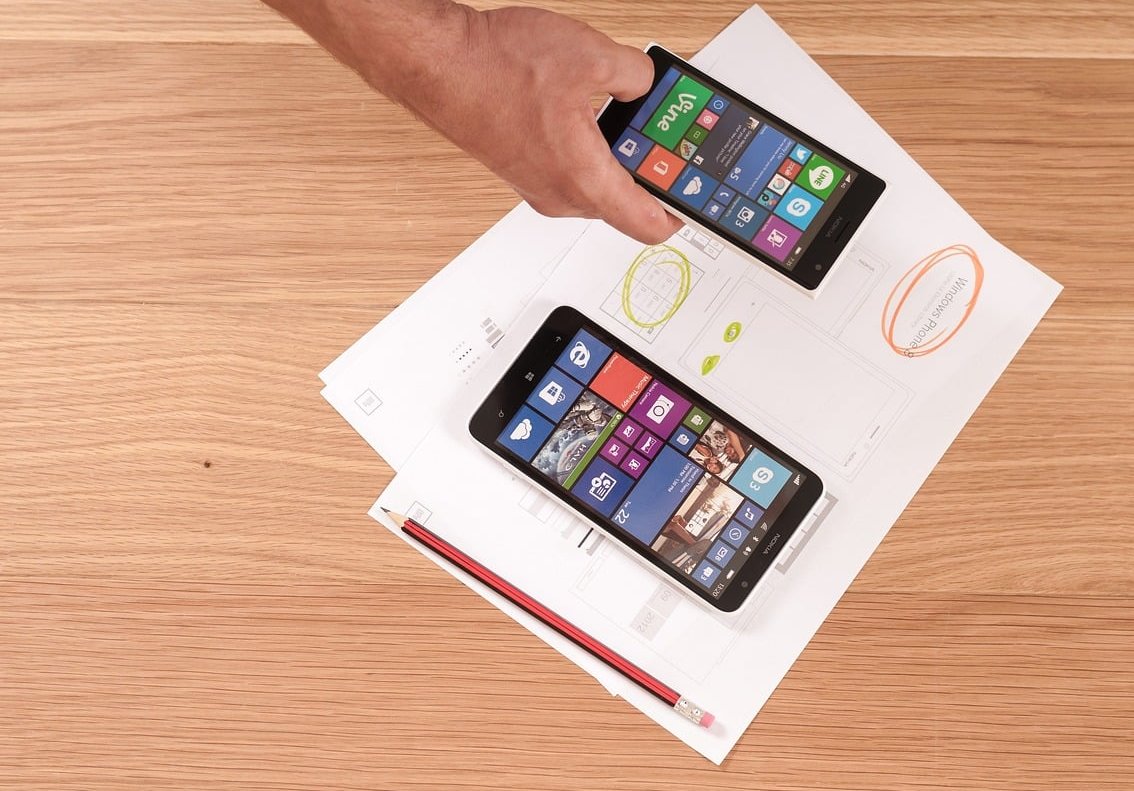
What to Do After Wireframing
Once your wireframes are stable, you’re ready for the next stages:
- High-fidelity mockups: add colors, typography and real content
- Interactive prototype: make it clickable to simulate the real app
- Hire a developer: your wireframes become the spec sheet
- Build an MVP: ship a first version to real users
At VRS App, we’ve seen founders save months of development time simply by showing up with clear wireframes. It’s the single most impactful thing a non-technical founder can do before writing code.
FAQ
Do I need to know how to draw to wireframe an iOS app?
No. Wireframes use basic shapes (rectangles, lines, circles). If you can draw a square, you can wireframe. The team at balsamiq.com reached a similar conclusion.
How long does it take to wireframe an iOS app?
For a simple MVP with 5 to 10 screens, expect 1 to 2 weeks including iterations and user feedback. Complex apps can take a month or more.
Can I use ChatGPT or AI to generate wireframes?
AI tools can help you brainstorm and generate rough layouts, but they lack the context of your users and product vision. Use them as a starting point, not a replacement for your own thinking.
Should I wireframe for iPhone or iPad first?
Start with iPhone. It’s the most constrained format, and if it works on iPhone, adapting to iPad is much easier than the reverse.
Is Figma the best tool for iOS wireframing?
Figma is a great all-around tool, especially because most designers and developers already use it. Balsamiq is better if you want a rough, hand-drawn look. Both work well for iOS wireframes.
Do I need to follow Apple’s Human Interface Guidelines strictly?
You don’t need to follow them perfectly, but respecting the major conventions makes your app feel native and increases the chance of approval on the App Store.
Final Thoughts
Wireframing an iOS app isn’t about being a designer. It’s about thinking clearly. The founders who succeed are the ones who take the time to visualize their idea before spending money on development.
Start with paper, follow the 7 steps, and don’t be afraid to throw away your first attempts. Every iteration brings you closer to an app that users will actually love.
Ready to turn your wireframes into a real iOS app? VRS App helps non-technical founders bring their ideas to life with clear design and rock-solid development. Get in touch to discuss your project.